We all know that copywriting is the art of writing creative content to persuade the targeted audience to take your desired action. This action may help you fulfil your purpose or goal. The final product, produced after copywriting, is ad copy or sales copy.
But, do you know the main differences between what makes an ad or sales copy good or bad. This guide is all dedicated to understanding good copywriting and bad copywriting signals. However, sometimes people starting in copywriting may find it challenging to identify the signals. Thus, to make things simpler, we have also compiled together 12 examples of good copywriting and bad copywriting to help you gauge the concept better.
So, if you want to become a professional copywriter to generate more leads or conversions through it, this guide is for you. Continue reading till the end to find what is good copywriting and explore through the examples of bad copywriting.
So, without further ado, let’s first start with the best practices of copywriting.
12 Examples of Good Copywriting
Clever people want to understand how something is done, while fascinated wordsmiths want to learn how it works. In order to master the craft of good copywriting, you need to dissect the examples and review them line by line with fascination. Only then will you be able to produce copy that converts your targeted audience into customers without objection.
1. Basecamp
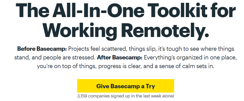
Basecamp is well-known for its compelling copy and landing pages. They use a conversational tone with concise sentences. It is similar to what their targeted segment uses while they think or talk about their business. One example of their effective copy can be seen in the image.
Amateurs may think, okay, so we have to use short sentences and try to initiate a conversation in their head? That’s easy, ‘I can do it.’ However, there is another detail to the copy that makes it effective. It uses a timeless copywriting formula, PAS. Here is how it works:
Problem – The step of this technique is to highlight the problem and pain point of your potential customer. Read after ‘before basecamp’. They present your issues before you. These are nightmares of any business owner or manager, things slipping out of hand because of disorganization.
Agitation – Next, they emphasize the pain points by taking you down to what could be worse. Your deadlines have passed, and your team is stressing out. Any manager knows that working with a stressed team becomes challenging beyond imagination. It is a crucial step to stimulate your audience before presenting the solution.
Solution – Finally, they present the solution, ‘After Basecamp’. How using it can make the reader's life all sorted and organized.
2. Ricola
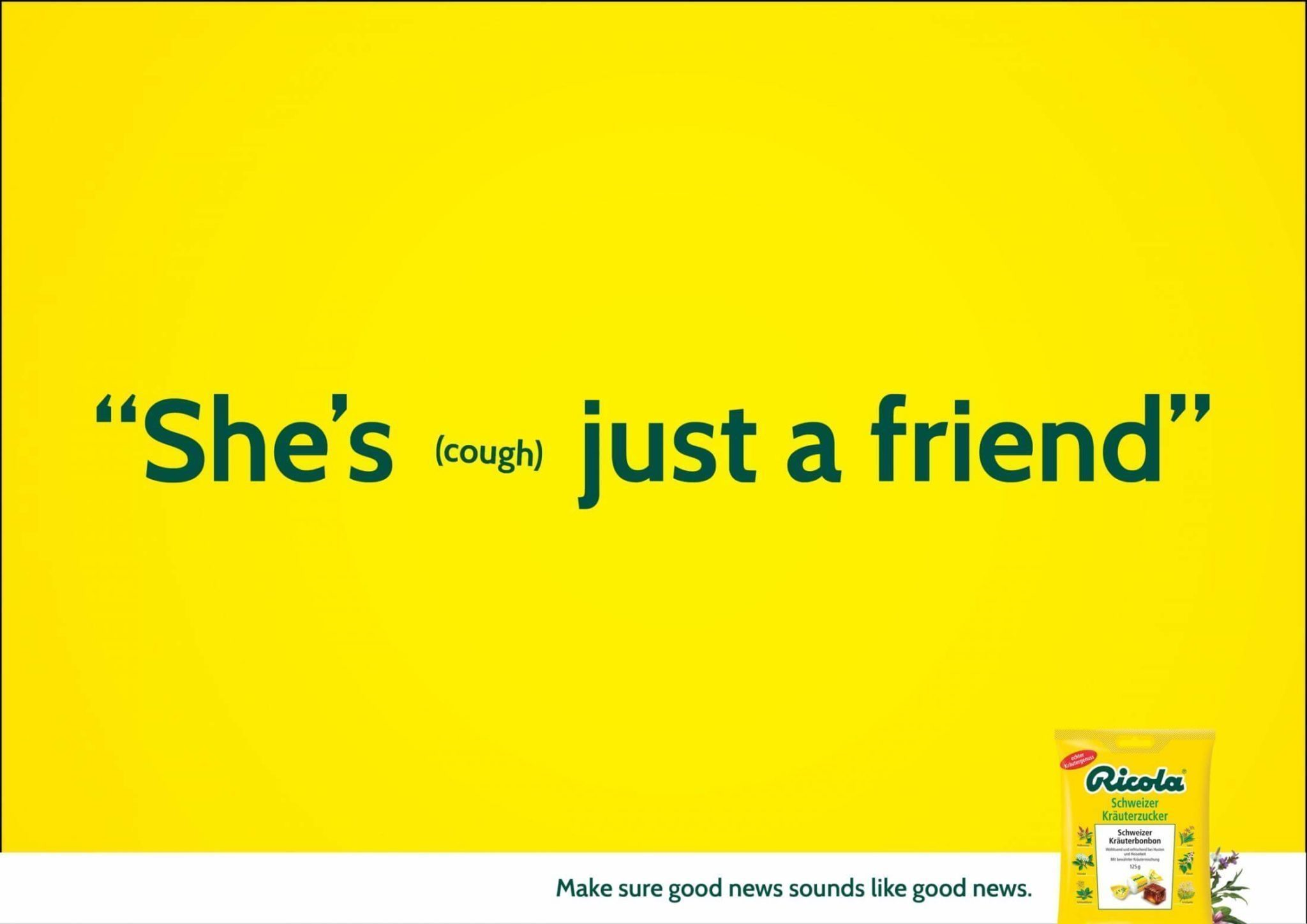
Simple and impactful. This ad describes the purpose of Ricola very well. In 2014, the brand ran a series of ads showing how a misplaced ‘cough’ can change the entire meaning. It explains how cough at the wrong time can change the meaning pretty well. Even the tagline needs praise, ‘Make sure good news sounds like good news’.
What makes this ad copy work is it is simple, relatable, memorable, and contains edgy humor. Adding fun in a technical industry was a brilliant strategy on the marketer’s end.
Moreover, the ad copy does not persuade the audience in any way. It does not contain any headlines or taglines, promoting Ricola as the best cough drops, etc. It is just a memorable copy showing a recognizable Ricola packaging and using the same product color all over the ad. The goal here was to make Ricola top of the mind brand while people go to the shop to buy cough drops.
3. BarkBox
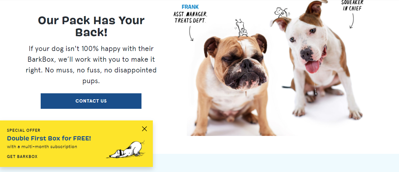
BarkBox is focusing on direct selling to dogs in a fun way. If you quickly go through their website after you are done reading our guide, you will understand what we mean. Cute dog images and using their customer's language make the whole experience worthwhile. Leaving the complete website review to another day, and review only this section for now!
Who does not want their pups to be happy? We all do, and they are offering you the same, in a conversational tone using short sentences. Here, the picture of two cute dogs with designations and names mentioned instantly connects the reader. Moreover, the CTA placement is good; people will instantly click if they relate to it.
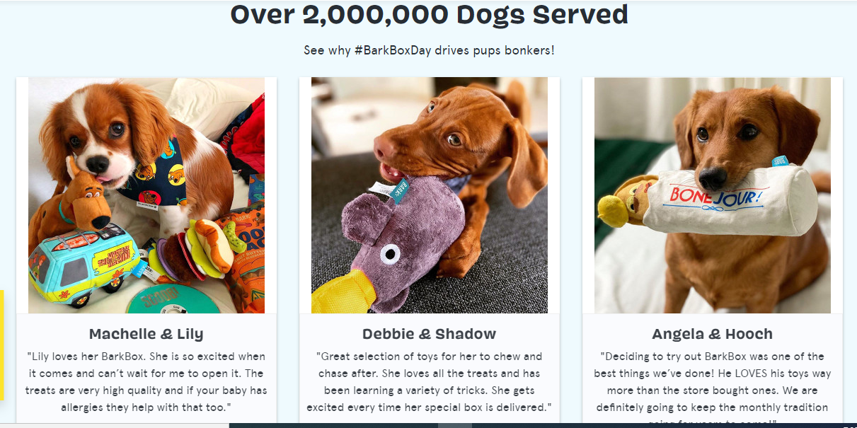
Bonus: They even display social proof! They served over 2 million dogs, and they got the proof to show you and build trust and credibility.
4. MailChimp
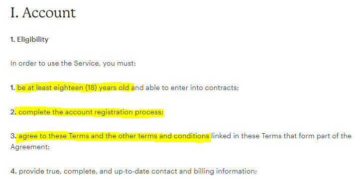
Who reads terms and conditions with interest? We all grasp for air while going through the terms. Some even check the box without going through the most crucial section on a website because they made it sound boring.
Here’s a good copywriting example that made even reading the terms pleasure. MailChimp’s terms use simple language that incorporates bullets and headers. They even have a sidebar explaining everything effortlessly.
5. Apple
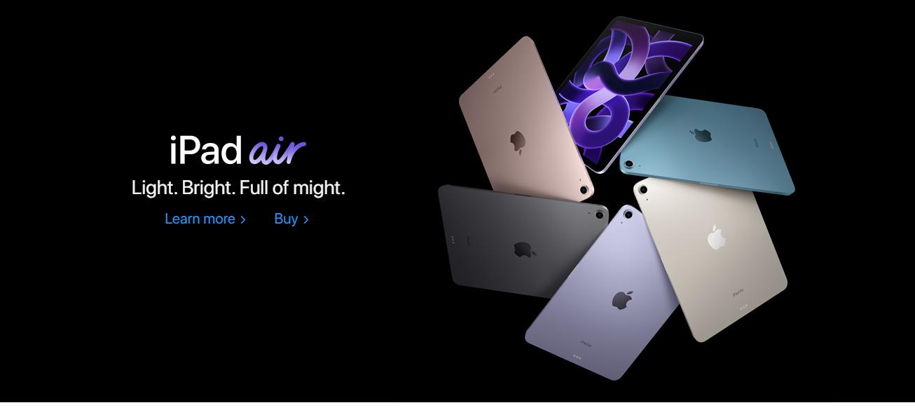
Apple seems to have poetic copywriters. They create taglines that rhyme. The rhythm in their taglines is almost identifiable. If you want to learn wordplay, create impactful taglines in fewer words. You can learn a lot from going through Apple’s website.
6. Rolls-Royce
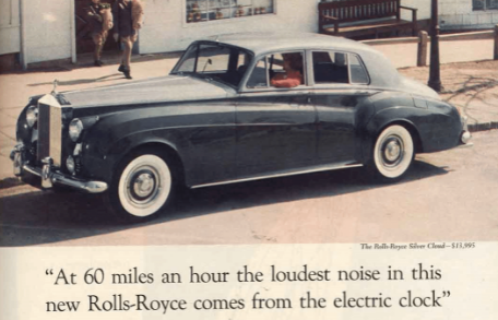
In 1958, David Ogilvy – the father of advertisement, penned down this copy for Rolls-Royce. After several decades, this ad copy still serves as one of the good examples of copywriting. The headline is stellar and does not claim that the car is quiet; instead, it provides a sensory and rich experience to the targeted audience.
The body of the copy itself is nothing short of an art piece. It states that engineers used a stethoscope to listen to the axle-whine. They left it to the reader to decide whether the luxury car is quiet or not. However, the mention of a stethoscope to hear the sound made it clear in the subconscious that it is quiet. It is the power of good copywriting.
“In my Rolls-Royce advertisements, I gave nothing but facts. No adjectives, no ‘gracious living.’”
– David Ogilvy
The upper-class targeted audience craved peace and quiet after WWII. And this ad presents them with the luxury of experiencing it. Every point enables the reader to immerse further into the ad by painting a picture in their minds and making the product memorable.
7. Poo~Pourri
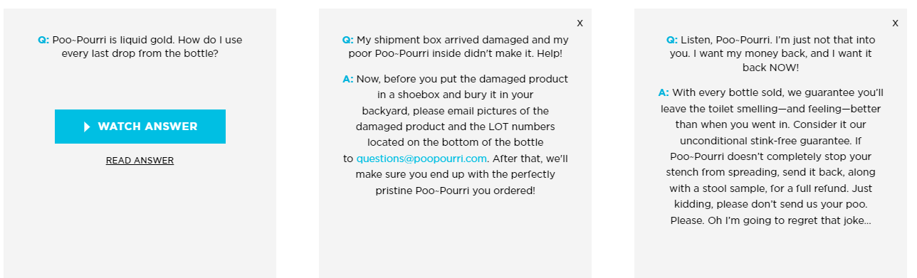
Here’s the best example for creating an engaging FAQ page to keep readers hooked till they find their desired question. We all know the struggle of finding our relevant query in the FAQ section. The boring design and straightforward answers make it even worse. But Poo~Pourri take a different approach by adding exciting questions and answers, showing the sheer skills of the copywriter.
They used the page to overcome objections that their customers come across while purchasing or after using the product. You can see in the image how they stopped the audience wanted to return their product in a funny yet intelligent way.
“Make it simple. Make it memorable. Make it inviting to look at. Make it fun to read.”
– Leo Burnett
Moreover, the design of the page is also stellar. Different sections are dedicated to distinct categories, and there is also an option to watch the answer if you are not into reading. The page is a reminder to every copywriter out there purchasing products does not happen only on the product pages and emails. However, it is a journey from web page to page, and you should use every word to create emotional triggers that motivate your audience to make the purchase.
8. RXBar
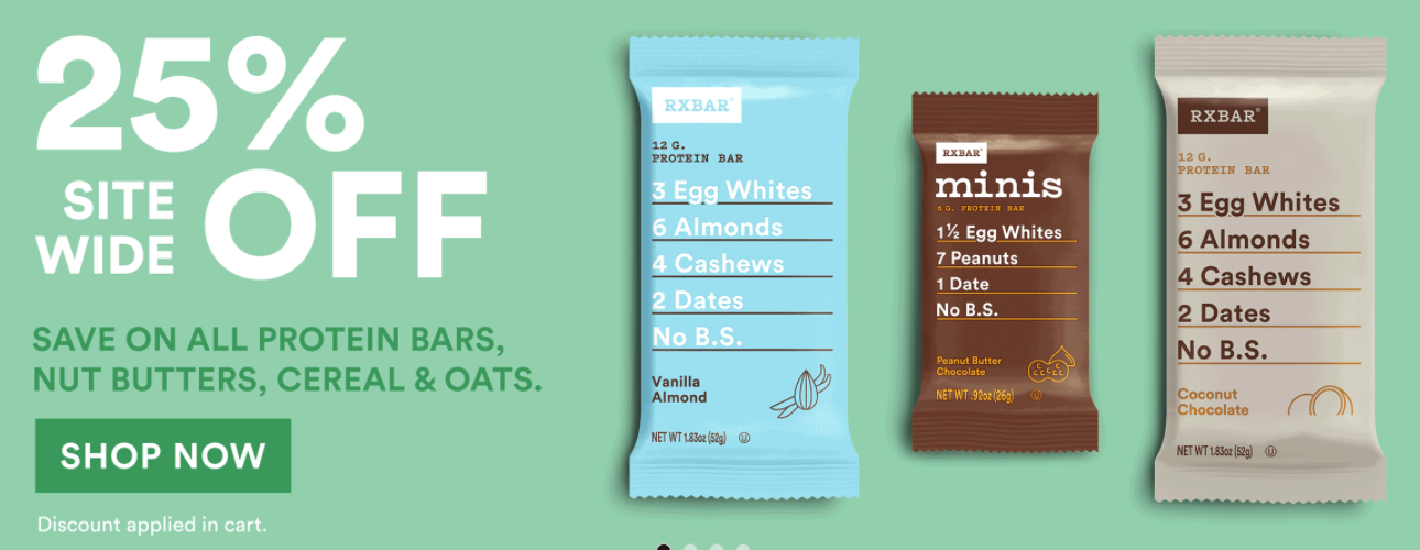
Protein bars are all about the ingredients, and RXBar played it well. They use their ingredients, the central focus of their packaging.
Their targeted audience is health-conscious individuals who want to know what they consume to stay fit and healthy. RXBar provides them with the details, complete transparency, and simplicity.
“The very first thing I tell my new students on the first day of a workshop is that good writing is about telling the truth.”
– Anne Lamott
Most of the time, copywriters focus on highlighting the benefits instead of features. But here, features are the focus and make the product stand out. Because features are translated into benefits in a saturated market, and their copywriter understood what is at stake to create the blue ocean.
9. Baron Fig
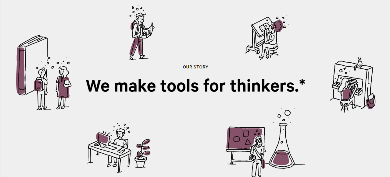
Baron Fig sells notebooks. Here see how they presented it through well-thought-of words. “We make tools for thinkers”. Simple, short, but powerful. The tagline on their ‘our story’ page instantly hooks the audience and motivates them to continue reading.
The story travels the reader through several sections. The first few sections emphasize that Baron Fig facilitates thinkers throughout the world by giving them the tools they need the most. That is, a notebook to jot down the ideas!
They also reflect that they are focusing on being socially responsible by planting a tree against every confidant sold. It builds a positive brand positioning. Moreover, they are a 100% employee-owned organization which is another excellent initiative and idea to form a strong brand image. Things like these strike the emotional cords of the audience, and they subconsciously believe that buying from you will support a good cause.
10. Volkswagen
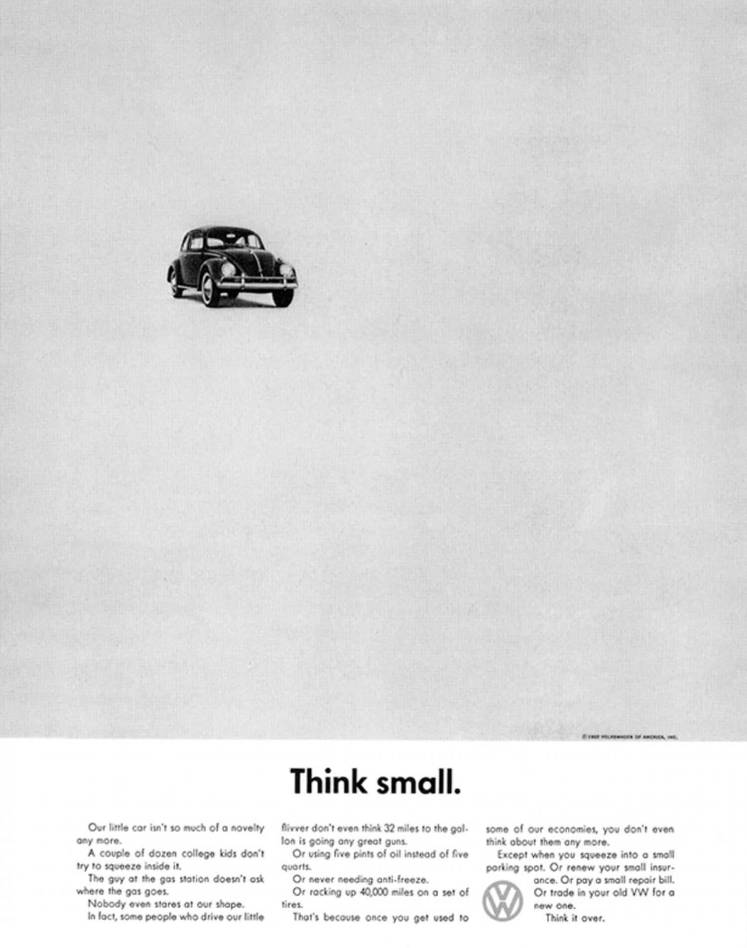
In the 1950s, Americans loved muscle cars. But, Volkswagen did the opposite. They diverted everyone’s interest toward small cars by highlighting their benefits. They emphasized that small cars use less fuel, require fewer maintenances, and have cheaper insurance.
For the same, they published this ad copy in black and white with a tagline, “think small”. Back then, full-color ads were standard. However, the DDB ad agency was challenged to sell the exact opposite from America’s aspiration. So, they advertised it in the exact opposite way. A black and white ad, small tagline, minimalist design, and the car pointing towards the headline to direct the reader’s eye.
11. Miss Clairol
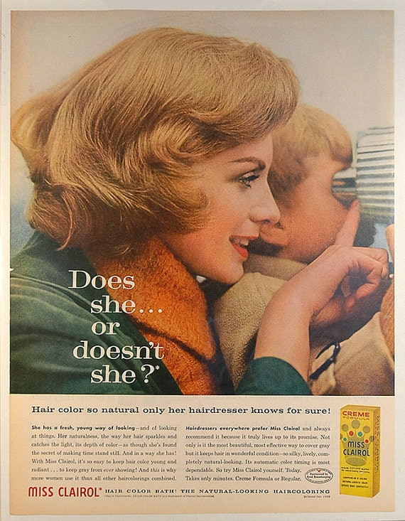
Whenever you are going through a physical change, you want people to notice it but not too much that they start asking you weird questions. For example, you do not want people to notice your liposuction, but at the same time, you want them to notice your six-packs. The same goes for hair color, and Miss Clairol’s copywriter did a fine job translating the concerns of every woman out there.
The ad copy also stresses its easy usability and quality by telling the audience that professional hairdressers also recommend using it.
12. Pepsodent
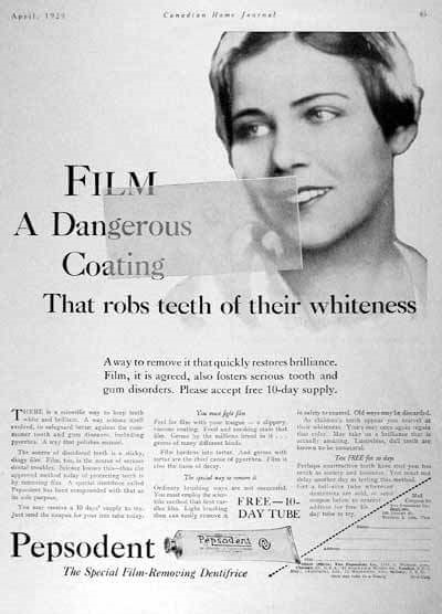
Before this ad copy, Pepsodent’s overall sales were relatively low. The main reason was that people were unaware, and only 7% were brushing their teeth. So, to increase sales, they needed to make people more aware.
In 1929, when Claude Hopkins wrote that copy, he knew he could not just rant about the product's benefits to an unaware audience. Therefore, he focused on highlighting the problem and made people roll their tongues over their teeth to feel the film on it. As a result, people started noticing the issue.
The copy was clever because it grabbed the audience’s attention, educated them, and offered a solution. Suppose you are in a niche, where your targeted audience is not buying your product. In that case, you should first identify your target segment’s awareness level from unaware, pain aware, solution aware, product aware, and most aware. Once you know them, it becomes easier to write a killer copy that converts.
12 Examples of Bad Copywriting
Just as analyzing good copies help you become a good copywriter, scrutinizing imperfect copies steer clear of things not to do in copywriting. Therefore, we have compiled together a list of 12 cringe-worthy, bad copywriting that failed miserably.
Publishing a lousy copy will cost you more than you realize. It will waste your money and put a spot on your overall brand image. So, without further ado, let’s explore some examples of bad copywriting to help you become a better copywriter, or at least not a bad copywriter.
1. Airbnb
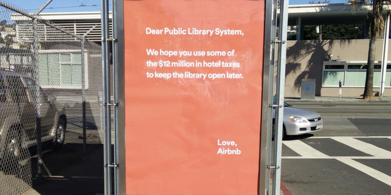
A scandalized ad plastered all over San Francisco made no sense to many people at first glance. Not just that it is poorly written, but it made the San Francisco Library system look bad.
However, if you do some digging, you will find out that Airbnb was asked to pay millions of dollars in hotel taxes. So, they thought to provide guidance to the government on how they should be using the money.
Another issue with the ad was, mentioning the public library system, which had nothing to do with the taxes they paid. The San Francisco libraries already struggled to get the much-needed financial support to keep themselves running.
They even were hand to mouth and were unable to pay their staff. They received heated backlash and, as a result, issued a public apology. The CEO of Airbnb admitted himself, “It made us look like jerks”.
2. Minnesota Health Plan
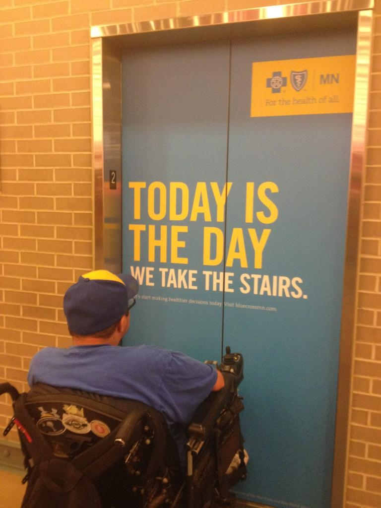
While making a point, the worst you can do is offend another group of people. Minnesota Health Plan wanted to promote a healthy lifestyle, so they thought to motivate them to ditch the lift and take the stairs.
However, they neglected a group of people who rely on elevators to move around in doing so. It looked insensitive because many people use elevators not because they want to but because they had to.
3. Advanced Products Inc.
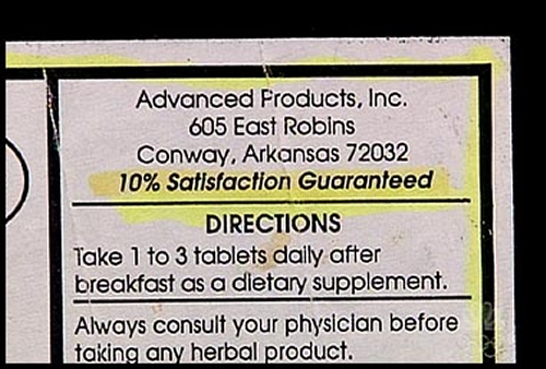
10% satisfaction? What a modest way of marketing! Well, it is a sheer example of carelessness and bad copywriting. Not just because they promised little satisfaction but also the copywriting style is dry and monotonous.
If you don’t want your copy to end up on this list, you should at least try to put some effort into making it look appealing.
4. Funeral Home
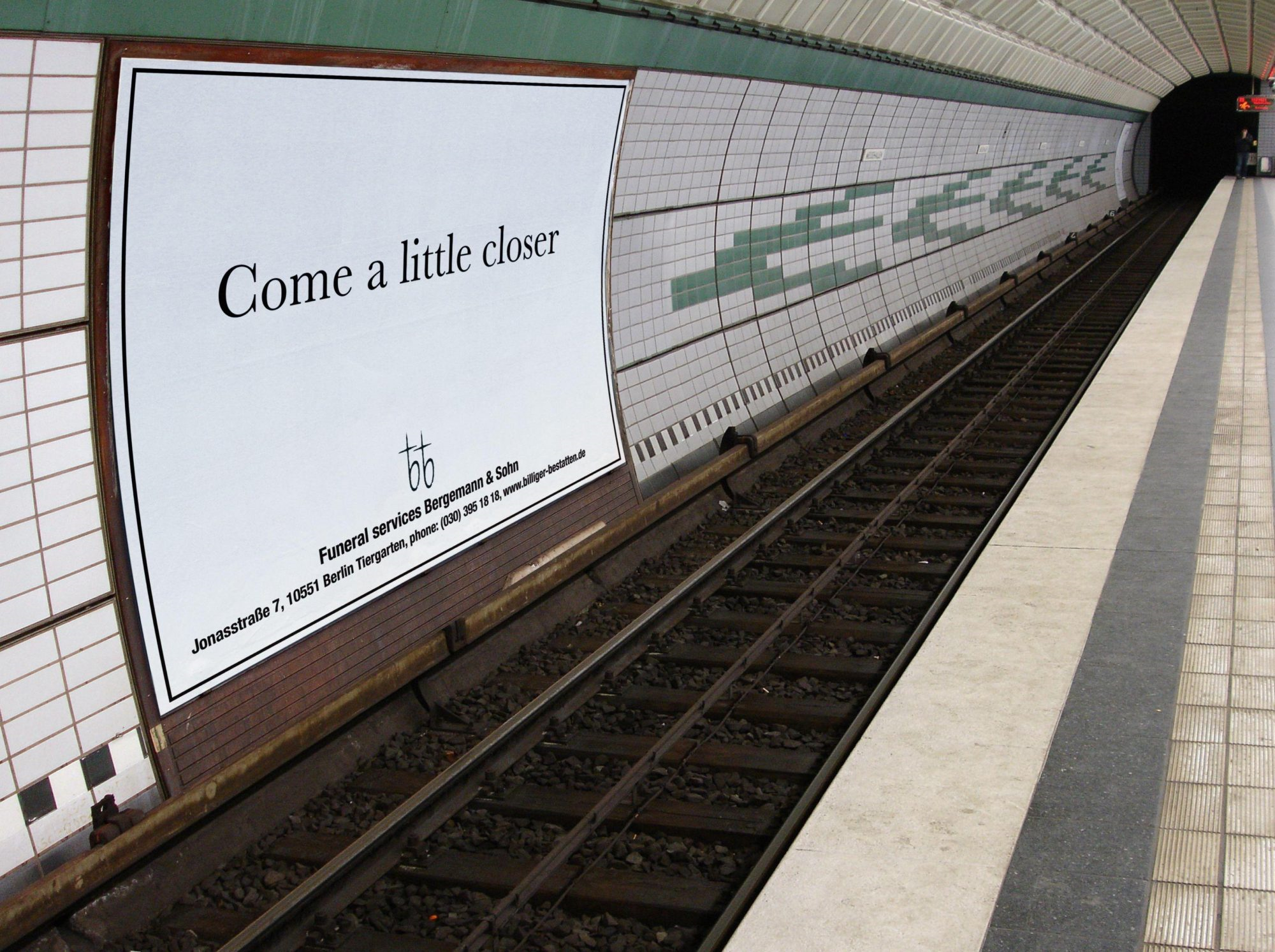
Placing a funeral home ad with a tagline on the other side of an underground railway track displays apathy. They certainly got attention with the tagline, but making fun of suicide and placing a place at a place like this may trigger depressed souls to take a drastic step.
Sarcasm, and creativity should never cross the fine line between empathy and apathy. We all have a responsibility towards society, regardless of the type of business we are promoting. Copywriters and ad agencies should be careful too, to never cross it.
5. Sun-Times
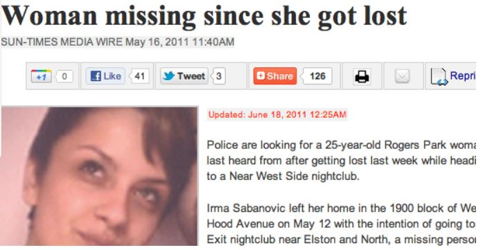
Most people only prefer scanning through the headlines when it comes to news blogs. In 2011, Sun-Times Media Wire made a blunder in the most important part of the news. The title reads, ‘Woman mission since she got lost”. Be careful while crafting your headline, or you will end in the same boat.
6. Lexus
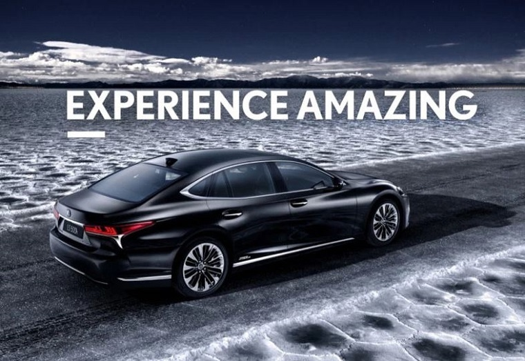
Major brands, including Nike and Apple, use short slogans like ‘Just Do It’ and ‘Think Different’. So Lexus also came up with a two words slogan. However, their slogan ‘Experience Amazing’ does not make much sense. While Apple and Nike did great with ad copywriting and created taglines resonate well with the targeted audience, Lexus’ slogan is just a failure that falls short of evoking the brand ethos.
7. Deliveroo
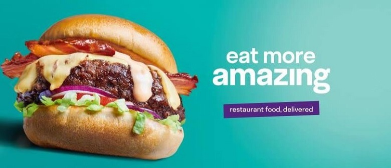
Previously, Deliveroo made a tagline failure by ditching grammar. It used an adjective as a noun and even dared to add ‘more’ with it. If it is amazing, then it is amazing, period. There is no need to add extra information because it only annoys the reader. However, their new tagline is this:
This, too, drastically failed to make a mark on the audience’s minds. It is a passive slogan that is easily forgettable. They need to hire an expert copywriter to make a lasting impact on their audiences’ minds.
8. Mississippi Literacy Program
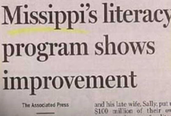
A headline about literacy program’s improvement and success: but the newspaper made a spelling mistake. It is not Missippi, but Mississippi. Wrong grammar and spelling mistakes are a big turn-off for audiences. It can destroy your brand image and shatters trust in your offerings.
9. Mashable
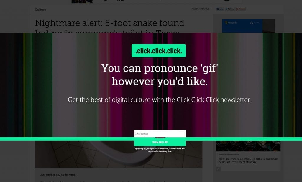
Many copywriters love spending their time reading. And some of them like to indulge in pop-culture content. Thus, it is understandable to slip in an inside joke in your copy once in a while. But doing it without providing any context can backfire.
Take a bad copywriting example from Mashable’s pop-up. They started their text with a debate of ‘gif’ pronunciation and then asked you to get the best digital culture with their strange named newsletter, ‘click click click’. Nothing of it makes sense because it lacks the context. Never do it!
10. I Heart Wines
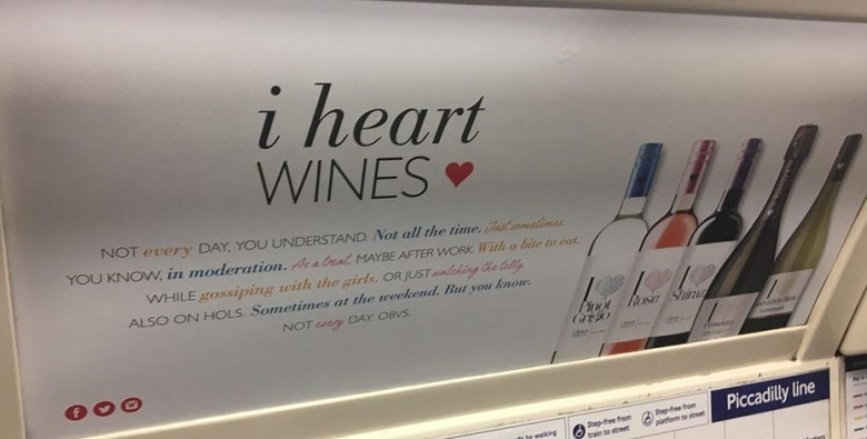
The intention behind this message by I heart Wines is unclear. Is the brand persuading you to drink more or running an anti-drinking campaign? This copy can create a lot of confusion about the brand positing.
Therefore, it is recommended that you avoid adding sarcasm and humor in your copy without coupling it with a slogan that makes the intention clear. Always think from your target audiences’ perspective to ensure your copy does not backfire.
11. Worker’s Head Injury!
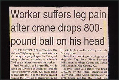
Another absurd headline that does not make any sense. How can a head injury cause leg pain? This copywriter penned it down without giving a second thought.
12. Teen Pregnancy Statistics
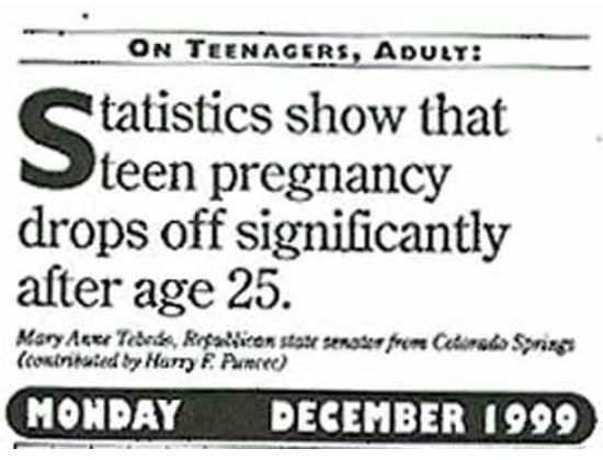
According to this newspaper cutting, teen pregnancy tends to drop after people cross the age of twenty-five years. Seriously? What does it even mean? Maybe because you don’t remain a teenager after crossing nineteen.
If you don’t want to become the joke of the day, like these newspaper cuttings, think from your head before coming up with a headline. There are several headlines that show carelessness from the copywriter’s end rather in terms of spelling, grammar, or logic. We cannot cover all of these, but we can give ideas and a head start.
Important Resources:
- SaaS Website Copywriting Tips
- How to write Sales Copy?
- Copywriting Tips For Small Businesses
- YouTube Video Script Writing
Conclusion
This guide helped you identify good copywriting and bad copywriting. We presented you with 12 examples of good copywriting related to various industries to help you identify how you should proceed if you want to pen down an impactful copy. On the flip side, we also shared 12 examples of bad copywriting to show you things not to do in copywriting.
After going through this guide, we hope that you will create copies that motivate audiences to become customers by canceling their potential objections.